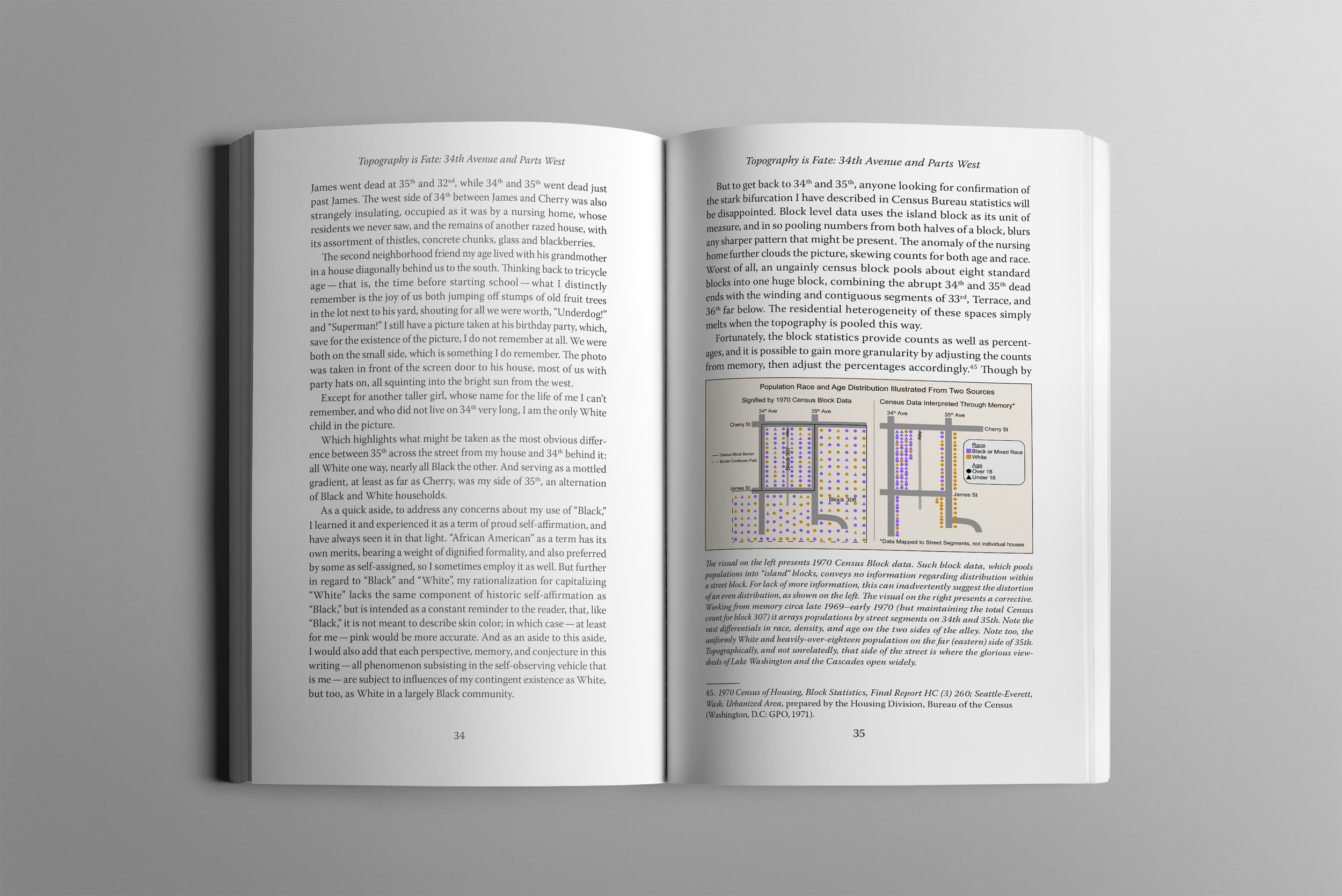
Designed and edited print and digital versions of Madrona: A Micro-Geography of the 1960s and 1970s.
My Role
Editor
Designer
Publisher
Post-Press Production
My Team
The Author
My Senior Project Advisor
Digital Projects Specialist
Digital Commons Publishing Specialist
Various Professors
Skills Improved
Long-form Copyediting
Page Layout
Map Design
Book Binding
Programs Used
InDesign
Illustrator
ArcGIS
Photoshop
Acrobat ADA Compliance
Chicago Manual of Style
Microsoft Word Track Changes
Summary
I edited, designed, published, and bound a 200+ page manuscript written by Cal Poly’s College of Liberal Arts Librarian, Brett Bodemer. Madrona: A Micro-Geography of the 1960s and 1970s is a memoir that mixes personal experience with archival research and detailed mapping to analyze factors that affect the definition of a neighborhood, like topography, friendships, and discriminatory housing practices.
I edited the manuscript according to the Chicago Manual of Style with some alterations decided on by the author and myself. I then formatted the text for both a digital and print version with the goal of creating an enjoyable reading experience for each medium. I also created maps using the ArcGIS plug-in for Adobe Illustrator to support the text. For the print version, I perfect bound two copies myself using a Duplo 280 and a polar cutter.
Process
Editing
My goal when editing the manuscript was to make the text clear while still preserving the author’s voice and style. The author wrote in typically long sentences, which became confusing the farther into the sentence readers got. I attempted to fix this by breaking up several sentences and adding commas to help clarify what words made up what clauses.
About halfway through editing, I realized the process would have been much easier if the author and I had established a style guide before starting to edit. A style guide would have helped me keep track of style and grammar decisions and eliminated the amount of times I consulted the internet for ambiguous grammar questions. We instead ended up having discussions about style choices as I edited.
Designing Maps and Data Visualizations
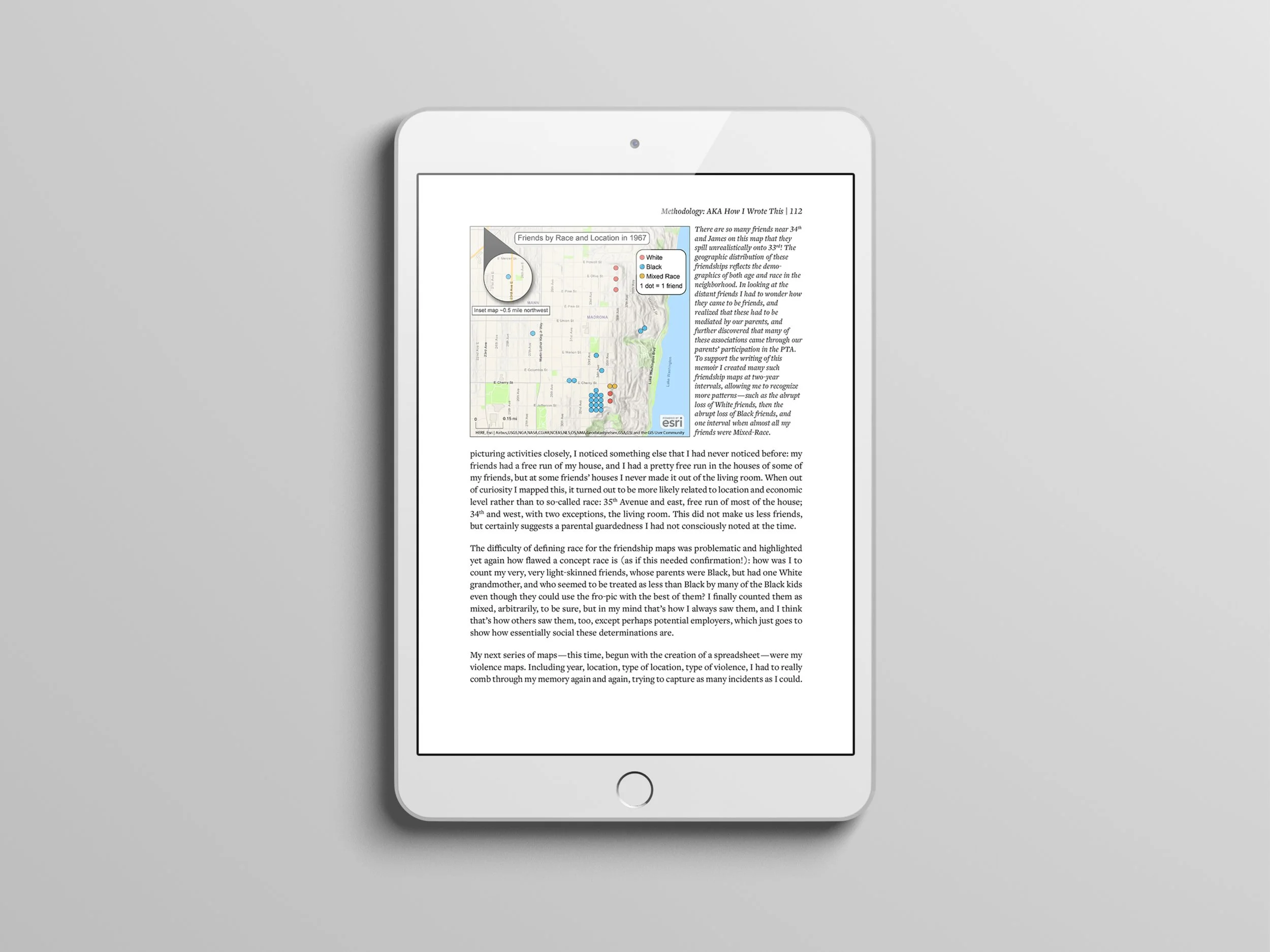
Creating maps was the part of this project I had the least amount of experience with at the time. Additionally, I was using ArcGIS, which was a new software program for me, and I was running out of time.
I used a vector layer that contained the streets, some buildings, and labels and put a layer on top that contained the topography shading. The topography shading was important to these maps because a steep cliff lies at the end of the blocks the text focuses on.
Designing Print and Digital Layouts
My goal was to format the text to create the most enjoyable and informative reading experience given the medium being used, either the online PDF downloaded from Cal Poly’s Digital Commons or the printed perfect-bound book.
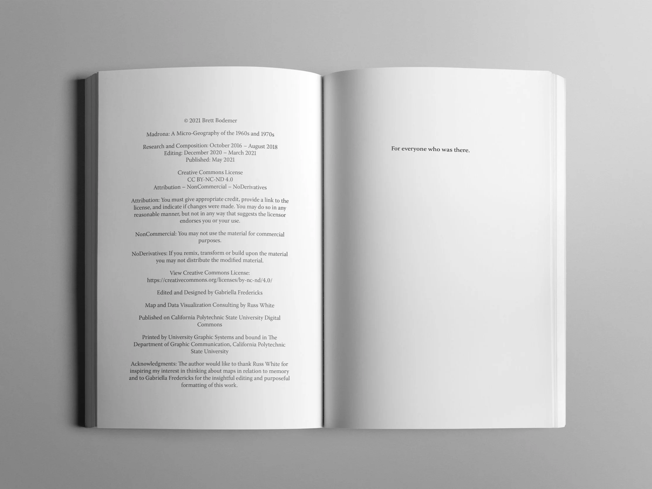
The biggest design decision I made for the digital version was to put the copyright and publication information as the very last page of the PDF but hyperlink to it in the table of contents. This way, readers are introduced to the text through a title page and table of contents and the amount of scrolling required to get to the actual content is limited. The table of contents is also hyperlinked to allow readers to jump to the exact places in the text they need to read.
If you click the hyperlink at the bottom of the above page, it takes you here:
If you return to the Table of Contents through the hyperlink above, the next page will be the text:
The digital version also has larger margins to give the eyes more white space to rest, a larger font, and spaces after each paragraph instead of indenting the first line of a new paragraph. The digital version’s body copy is FreightText Pro Medium with 13 point size and 17 point leading. There are 0.2 inch spaces after each paragraph with 1 inch margins.
The print version ‘s body copy is Warnock Pro with 10 point size and 13 point leading. There is a 0.15 inch first-line indent to signify the beginning of new paragraphs.
Designing a Cover
After intensely prepping the inside text, designing covers felt like a huge reward. I presented the author with the three options below and he liked the brick cover the best because he felt like it best represented what the book was about.
The printer told me the width of the spine so I could design the cover to perfectly fit around all of the pages.
Binding the Print Version
I perfect bound two copies of the print book for the author and myself.
I had the gut pages printed on 70 lb. uncoated text paper and the cover on 100 lb. dull coated stock. After lining all of the pages up and ensuring they were in the correct order, I placed them into the Duplo 280 Perfect Binding machine. I then loaded the cover into the machine, and it adhered the cover to the guts. After letting the glue on the binding dry, I took the books to the polar cutter where I trimmed off their bleeds. One copy of the book is 1/16 of an inch smaller than my intended width of 5.5 inches because the polar cutter did not cut all the way through the back cover the first time.
Lessons Learned
This project taught me about a million different things about editing, designing, book binding, working for a client and working virtually. Here are some of my key takeaways:
Always establish a style guide prior to editing
Have open and easy channels of communication with everyone involved in a project (especially for virtual work!)
Give yourself a reasonable timeline and be honest when you are unsure how long something will take
Nothing is ever perfect, it’s just due
That last bullet has become something I have to continuously remind myself. My favorite professor, Dr. Chelsea Milbourne, used to tell us, “Nothing is ever finished, it’s just due.” I could have worked on this project indefinitely, finding commas that I’ve since decided are distracting or moving a street label in one of the maps a half inch down. No creative work is ever completely perfect, there will always be new things you see and want to alter. Eventually, you have to be able to realize when something is pretty damn good and know then to call it done.
You can read my full reflection on the project here.


