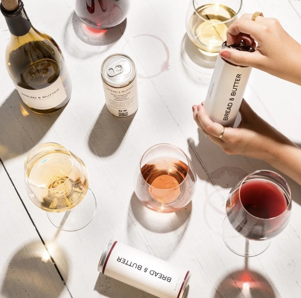
Designed and pitched can concepts for Bread & Butter’s pinot noir line extension.
My Role
Creative Intern
My Team
Creative Director
Brand Manager
Production Manager
Skills Improved
Designing for Consumer Packaged Goods
Can Design
Concept Presenting
Programs Used
Adobe Illustrator
Adobe Photoshop
Summary
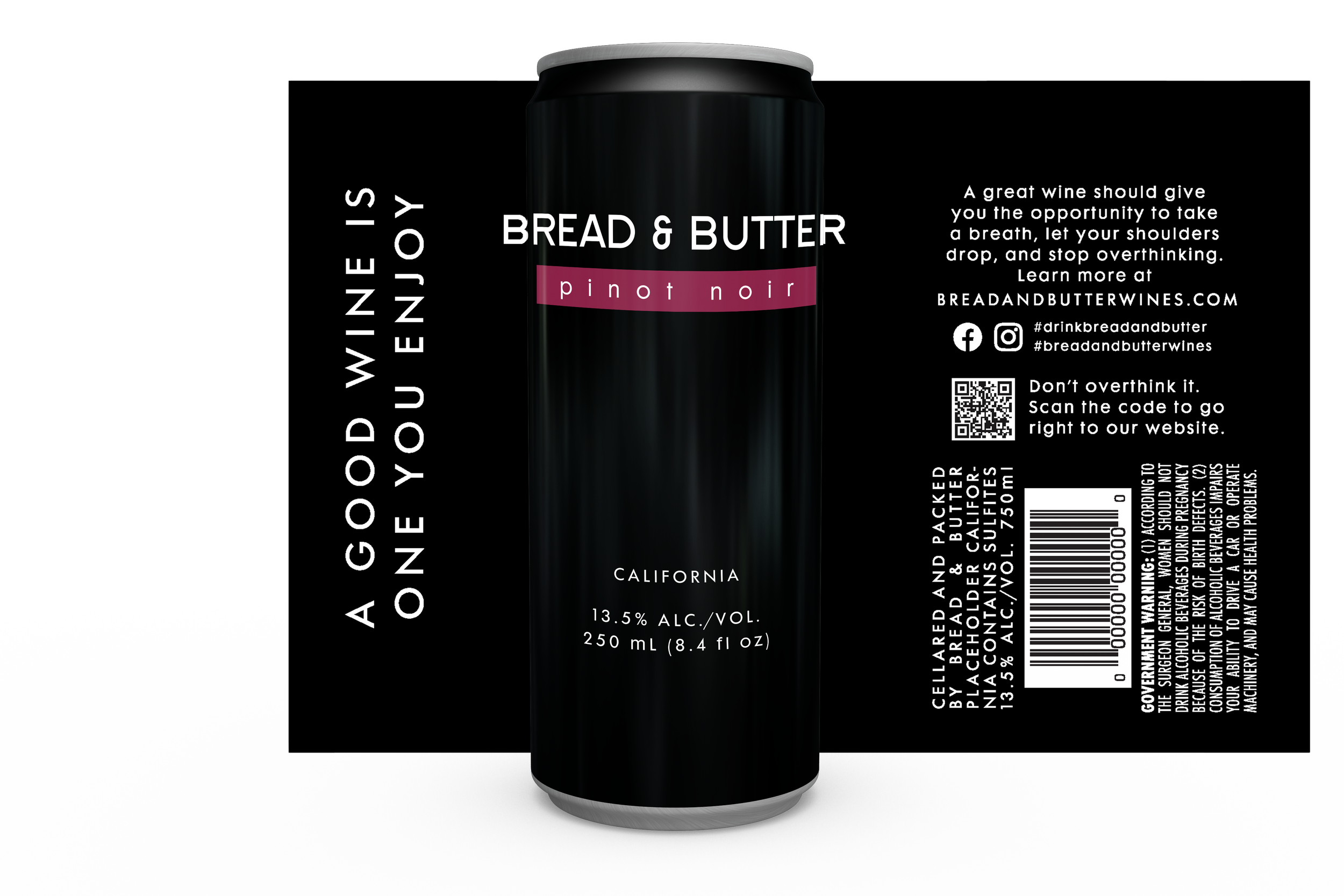
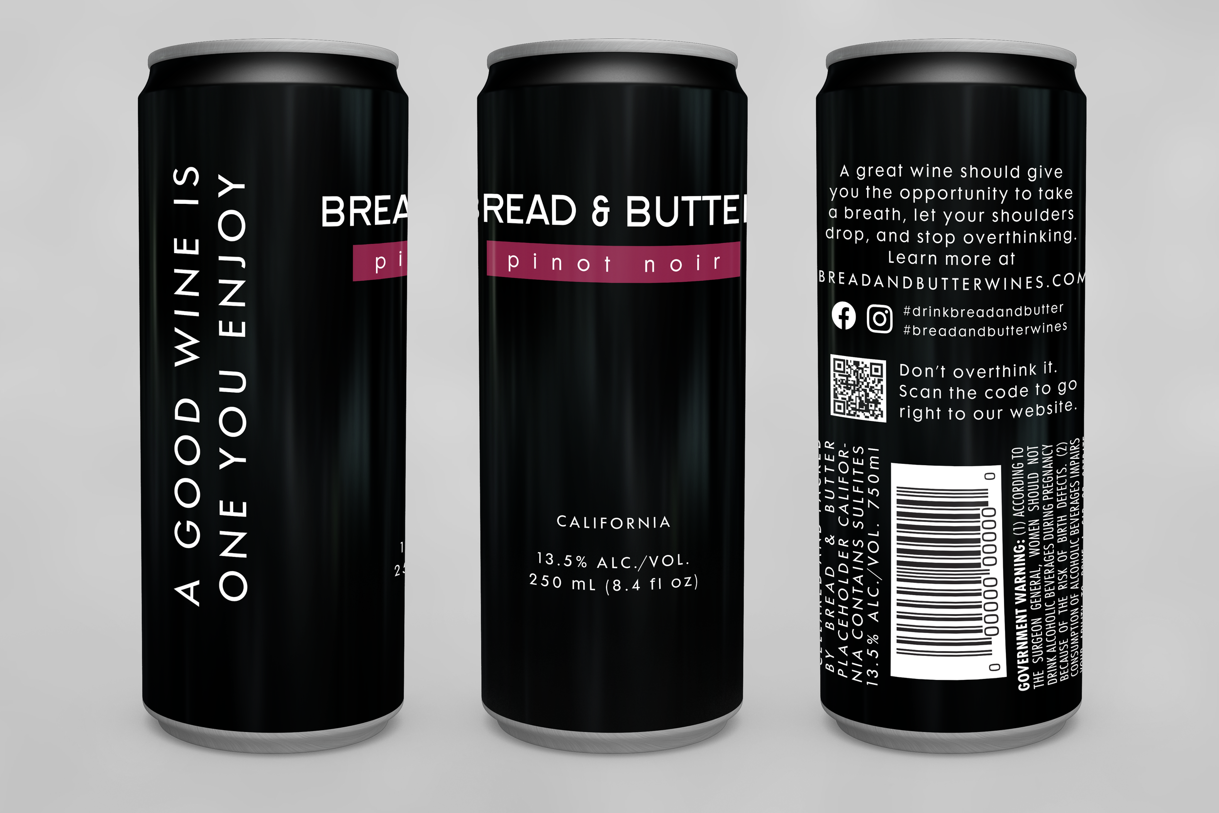
As an intern with WX Brands, I designed two can concepts for Bread & Butter’s canned Pinot Noir. The other concepts the Creative Director was presenting to the marketing team all had white backgrounds. I choose to use a black background to give the concepts more diversity while still following Bread & Butter’s brand guidelines.
Final Concepts
Process
I was assigned this project after interning for WX Brands for only about 2 weeks. Because of this, I spent a good amount of time familiarizing myself with Bread & Butter’s brand before sketching out any can designs. I was also shown the other concepts that were being presented and was asked to some alternative options in case the marketing team wanted something different for the cans.
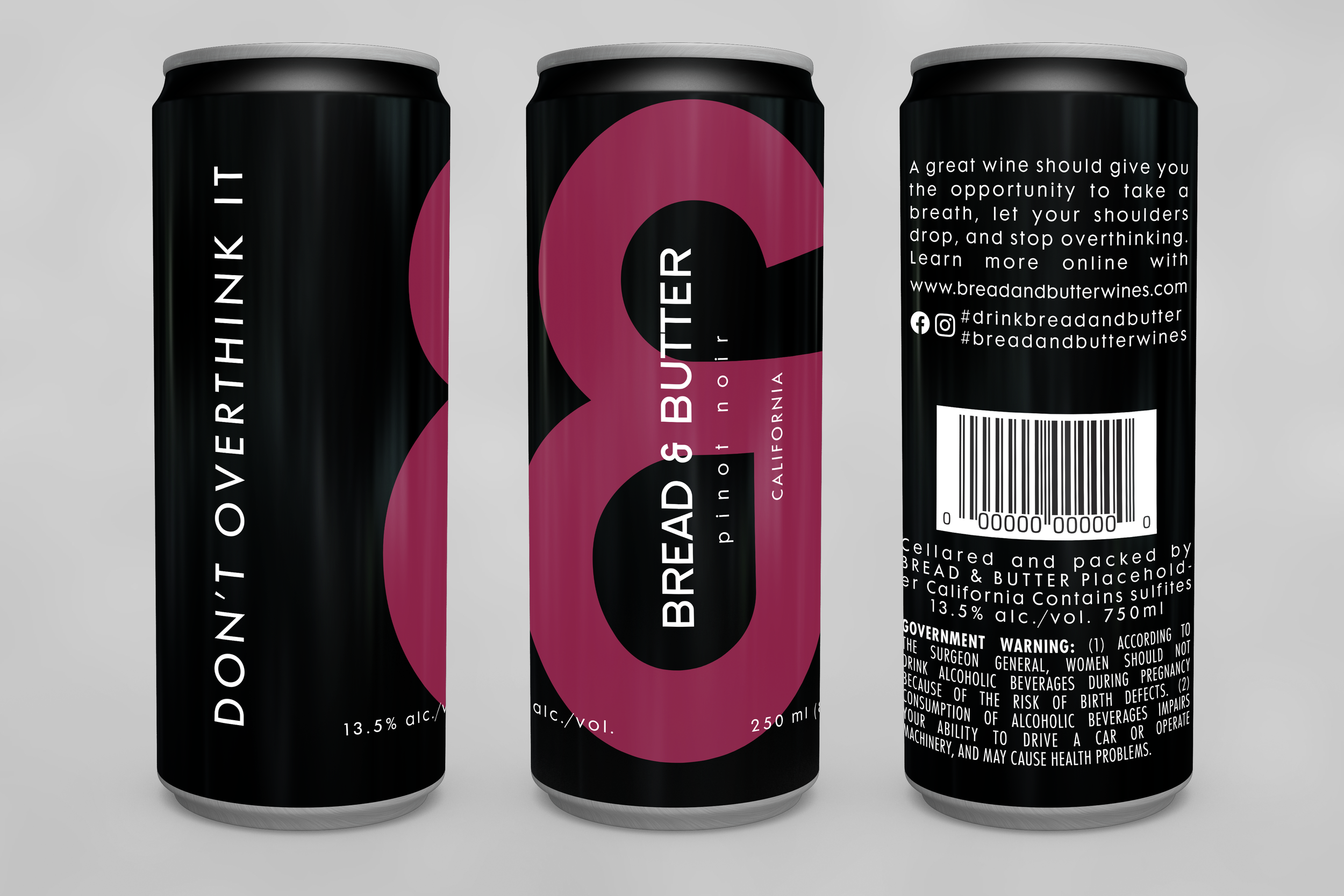
The Bread & Butter brand is focused on simplicity, so I designed these to be simple but still eye-catching. The beauty of putting wine in a can is that it will get brought to new places and cans are typically more popular with younger consumers. I wanted the cans to be Instagramable, with a cute saying or the bold ampersand from Bread & Butter’s brand.
Final Product
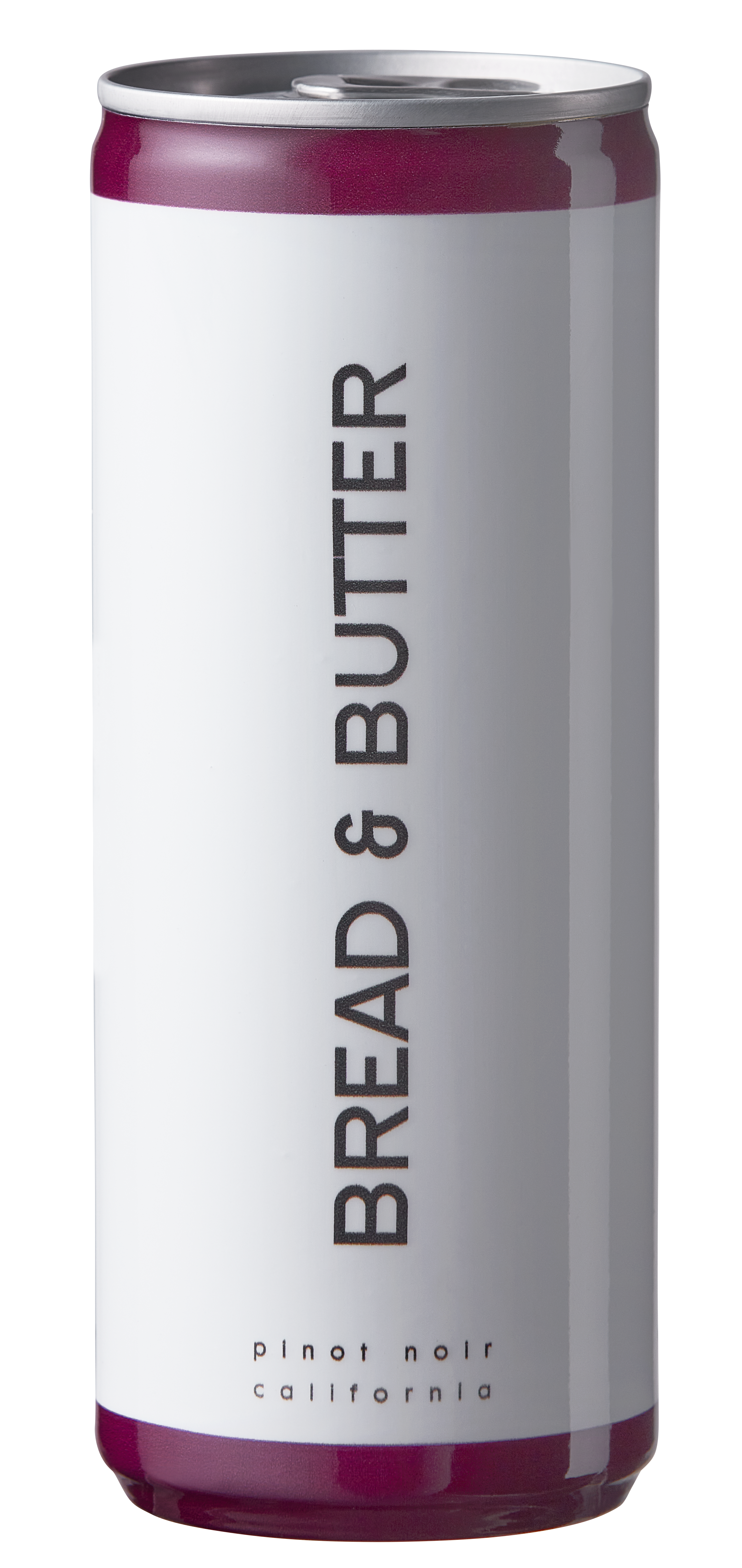
The final can design ended up having a white background and more closely following concepts designed by the Creative Director. The final product is beautifully simplistic, like much of Bread & Butter’s products. However, I do think these cans are missing that attention-grabbing, Instagramable factor and therefore losing an opportunity for this canned wine to appeal to younger consumers through its packaging.
Lessons Learned
Since this was my first time designing something that was going to be printed on a can, I learned an extensive amount can design. I also learned so much about legal requirements for wine cans and struggled through the design challenges of making a cellared and canned statement, barcode, and government warning look aesthetic while meeting the specifications on a can that is only so big.
A large part of this project too was presenting my concepts to the Bread & Butter brand and marketing managers knowing these concepts would follow those of my Creative Director, someone who has worked in the wine industry as a lead creative for over 20 years. As an intern who had only been working there for a few weeks, it was an extremely intimidating task, but I was confident in the design choices I had made. I presented them knowing they differed stylistically from Bread & Butter’s other products, but still followed the brand guidelines and appealed to the canned format.


